This first infographic is titled “The Most Insane Roller Coasters Around the World,” and can be seen below.

As one can see, this infographic uses a good amount of contrast, utilizing red and blue, which are classic opposites (though not complementary) used extensively in media and pop culture. It uses right-aligned text for years, places, and information under the section titled “History of the roller coaster,” drawing attention to its main image, that of a roller coaster train flying down the tracks. The colors of this section repeat, making the infographic look connected, and the font and text size is consistent. There does not seem to be much wrong with this section in terms of content; however, I must touch upon a few things I thought were missing. For one, there is no mention of the first roller coasters to break 200 feet (Magnum XL-200), 300 feet (Millennium Force) and 400 feet (Top Thrill Dragster, if one is speaking of full-circuit roller coasters), even though it touches on the first roller coaster to reach 100 feet. This felt incongruent to me, though perhaps it would not to others.
The following sections, speaking of the tallest steel roller coasters (though the section contains only one), park with most roller coasters, tallest steel roller coaster drop, and admission prices, also use contrast well. The blue against the green works to draw the eye, though perhaps the images are a bit too small. The white text on the green works well, and the larger font size draws the eye. The yellow of the pay one price, though, is a bit too close to the green. In addition, It grated on me that, while Kingda Ka was listed as both the tallest steel roller coaster and having the tallest drop, one figure is presented in meters and the other in feet. This only serves to confuse, and is not a good choice.

The section below it, that of the “Top 10 Ultimate Roller Coasters On Earth,” is presented well. The design repeats, and the layout is pleasing to the eye. Fonts repeat, left-alignment and center-alignment is used, and overall, everything is used to good effect. That said, I must refute this infographic’s findings – its choices for the “Ultimate Roller Coasters” are subjective at best, and many of these roller coasters are similar (Top Thrill Dragster and Kingda Ka are practically the same ride). In addition, some of them aren’t exactly what I would call true roller coasters, as they are not full-circuit.


Now this is what I call busy! Though it uses contrast, I believe it to be contrasting a little too much, as it is a bit difficult to read the words and follow the logic of the infographic. The information and the fonts are disjointed; the color scheme comprises of too many colors, and the organization seems to have no logical categorization. An example of this can be found in the number of roller coasters listed at the top of the infographic – while the number of total roller coasters is provided, it isn’t provided until nearly the bottom of the infographic.
The information is also incorrect in places, though I couldn’t hope to fact check the entire thing – one glaring mistake exists in the section titled, “How They Got Bigger Over The Years,” within which they label Magnum XL-200 as 201 feet (it’s actually 205 feet), Millennium Force as 201 feet (it’s actually 310 feet), Top Thrill Dragster as 213 feet (420 feet, actually), and Kingda Ka as 259 feet (it possesses a height of 456 feet, nearly double the figure provided).

With all of this said, this infographic lost its reliability for me almost immediately. I do not trust the author, I do not trust the infographic, and I will not present any more on it for fear of presenting incorrect information.
The next infographic echoes the first in a number of ways. Titled “The Fastest Roller Coasters,” it can be seen below:

As one can see, this infographic chose to use the same general color scheme as the first – blue and red for the top of the infographic, and green for the bottom (though overlaid with red, its complementary color, instead of blue). However, this infographic has just as many problems as its predecessors, if not more: it is difficult to understand. If one did not notice that they had color-coded the roller coasters on the red track at the top of the infographic, they may be hard-pressed to understand the bottom half. There is no identifying information except the color – though the information is grouped together well, if one doesn’t remember the colors and desires more knowledge on the subject, he or she must scroll back up to the track and look again.
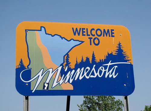
As such, while the information is presented in a colorful, informative fashion, this does not help anything if the reader cannot understand just what is being presented. In addition (and perhaps due to limited space), the roller coasters listed in this infographic that are within the same amusement park (Millennium Force and Top Thrill Dragster, for example) are at different points in the map. Cedar Point, the park that operates these coasters, is in Ohio; the points on the map make them seem to be in Minnesota and Indiana, respectively.
Sadly, I do not believe these three infographics were up to snuff – though their audiences were comprised of people like me, who love roller coasters, they all seem to fall short, providing inaccurate information, confusing graphics, or both.