Friday, April 22, 2016

Reminiscence


The semester is drawing to a close. Finals are next week - as for me, I have three plus a final paper. It is, of course, a stressful time, but it is also a time to look back on the classes I attended and learned from over the semester. Of the classes I took, I believe the one I am writing this blog for to be the most fun - with freedom for creativity and encouragement to think outside of the box, I felt like I did pretty well in this course. And I had fun, too! I was able to do three separate things involving the things I love most in the world - roller coasters. Within my group, I'm sure it's been an enlightening experience as to my favorite hobby - you have been privy to two of my roller coaster-centered blogs, though not my roller coaster enthusiast's dream of a Prezi project.

I feel as if I may be getting off track, but in the same vein, I feel as if I am speaking as I am supposed to be, remembering the fun and the challenges that have been had this semester. I had never before worked with an Infographic or Prezi, and they were challenging to learn! Putting a voiceover on my Prezi slides was an endeavor that took me nearly three hours (two to find the program I needed, one to record), and I was so, so proud of that accomplishment.

You can see my Prezi here, if you'd like.

In addition, I will also subject you to my own infographic, as a way to look back on that project.


Finally, I will provide you with another Prezi, made relatively quickly (so please don't expect much), outlining what I've said here as well as adding a few more points.

It's been a pleasure working with you all this semester. I hope your summers and your next semesters (if you're not graduating) go well!

Monday, April 4, 2016

Digital vs. Print


I will be frank with you. I am bereft of any idea over what to write about for this blog entry. There are, indeed, two worlds to writing – there is of course writing for print, whether it be for a newspaper or an assignment or a book, and then… and then there is writing for the realm of the Internet, a beast that has not quite been tamed. It is difficult, I’ve found, to rehash our assignment into words – so perhaps I will begin instead with a story.

One of my professors once expressed a pressing concern to me: as writing transitions to computers and, specifically, to Microsoft Word, will we lose all knowledge of the writing process? Will we be able to see just how authors construct their masterpieces, their chefs d’oeuvre? Whereas we have the beginning stages of work from authors who wrote at the turn of the century and before, Microsoft Word allows editing that leaves no trace of the before – only the after. What have we lost, he mused, to technology? What secrets to writing will we never be able to see, now that the editing process is hidden from our sight?


Later, the same professor would pose me a challenge, though perhaps he did not think of it in this way: form something that everyone can consume, that most people that might happen across it would understand and appreciate. With no knowledge of just who would come in contact with what I created for digital media, I was lucky to be able to rely on myths and legends older than the Americas. But at the same time, I wondered at how much of my voice would carry itself within something that had to be somewhat generic, somewhat detached from my usual introspective works. I failed, largely, on detaching myself; the work I produced was a musing one, which is to be expected. I could not eradicate myself completely from my work.

Of course, it’s difficult to write for something that is online, when one is so used to writing something for print – something to hand in and parade about, an accomplishment within an assignment. But with online interactions being what they are – nuanced, brief, oft-unimportant – one’s style needs to change. One needs to be punctual, brief, to the point. In short, the opposite of what I usually am. People do not tend to stick around when something bores them when browsing the Internet, and if you’re boring, then you’re done. Gone, finished, forgotten. Just like that.

As such, I tend to approach online interaction as something like a mission: get to the point, Kate! You may be thinking that I have failed in this. Largely, I have – but I am much better about succinctness in this class than I will ever be in print. I am long-winded, wordy, and I don’t really know when to stop when it comes to assignments. Like this one. But, of course, I’m not really trying to stop myself here – I’m trying to write like this is a story of mine, because of the lead-in we were proposed: “how we approach writing in different environments.”


This is how I write in print, generally speaking. At least, I hope it is. But I hope I’ve made this point already, and am not either confusing you or sentencing you to reading a drawn-out campaign for naught. I hope, fervently, that I have captured some form of the assigned blog within this text. I fear that I have not, but as long as I have masked my lingering confusion effectively, I will chalk this up to a win.

Well, as long as I can include this obligatory picture of Cedar Point, that is. I mean, it’s practically tradition now, so my advice is just to go with it, you know? ☺


Thanks for reading.

Monday, March 7, 2016

Rhetorical Analysis: Infographics

Today, in anticipation of my own infographic project wrapping up, I will be looking at three different infographics, all of which are both not created by me and have something to do with each other. As a major roller coaster enthusiast (as one may be able to tell from my first blog), my mind immediately jumped to (what else) roller coasters. As such, the three infographics presented below will all give you some information about the greatest engineering feats in history (in my opinion, of course, ha)!

This first infographic is titled “The Most Insane Roller Coasters Around the World,” and can be seen below.


As one can see, this infographic uses a good amount of contrast, utilizing red and blue, which are classic opposites (though not complementary) used extensively in media and pop culture.  It uses right-aligned text for years, places, and information under the section titled “History of the roller coaster,” drawing attention to its main image, that of a roller coaster train flying down the tracks. The colors of this section repeat, making the infographic look connected, and the font and text size is consistent. There does not seem to be much wrong with this section in terms of content; however, I must touch upon a few things I thought were missing. For one, there is no mention of the first roller coasters to break 200 feet (Magnum XL-200), 300 feet (Millennium Force) and 400 feet (Top Thrill Dragster, if one is speaking of full-circuit roller coasters), even though it touches on the first roller coaster to reach 100 feet. This felt incongruent to me, though perhaps it would not to others.

The following sections, speaking of the tallest steel roller coasters (though the section contains only one), park with most roller coasters, tallest steel roller coaster drop, and admission prices, also use contrast well. The blue against the green works to draw the eye, though perhaps the images are a bit too small. The white text on the green works well, and the larger font size draws the eye. The yellow of the pay one price, though, is a bit too close to the green. In addition, It grated on me that, while Kingda Ka was listed as both the tallest steel roller coaster and having the tallest drop, one figure is presented in meters and the other in feet. This only serves to confuse, and is not a good choice.


The section below it, that of the “Top 10 Ultimate Roller Coasters On Earth,” is presented well. The design repeats, and the layout is pleasing to the eye. Fonts repeat, left-alignment and center-alignment is used, and overall, everything is used to good effect. That said, I must refute this infographic’s findings – its choices for the “Ultimate Roller Coasters” are subjective at best, and many of these roller coasters are similar (Top Thrill Dragster and Kingda Ka are practically the same ride). In addition, some of them aren’t exactly what I would call true roller coasters, as they are not full-circuit.


This next infographic, called “Roll With It,” can be seen below.


Now this is what I call busy! Though it uses contrast, I believe it to be contrasting a little too much, as it is a bit difficult to read the words and follow the logic of the infographic. The information and the fonts are disjointed; the color scheme comprises of too many colors, and the organization seems to have no logical categorization. An example of this can be found in the number of roller coasters listed at the top of the infographic – while the number of total roller coasters is provided, it isn’t provided until nearly the bottom of the infographic.

The information is also incorrect in places, though I couldn’t hope to fact check the entire thing – one glaring mistake exists in the section titled, “How They Got Bigger Over The Years,” within which they label Magnum XL-200 as 201 feet (it’s actually 205 feet), Millennium Force as 201 feet (it’s actually 310 feet), Top Thrill Dragster as 213 feet (420 feet, actually), and Kingda Ka as 259 feet (it possesses a height of 456 feet, nearly double the figure provided).


With all of this said, this infographic lost its reliability for me almost immediately. I do not trust the author, I do not trust the infographic, and I will not present any more on it for fear of presenting incorrect information.


The next infographic echoes the first in a number of ways. Titled “The Fastest Roller Coasters,” it can be seen below:


As one can see, this infographic chose to use the same general color scheme as the first – blue and red for the top of the infographic, and green for the bottom (though overlaid with red, its complementary color, instead of blue). However, this infographic has just as many problems as its predecessors, if not more: it is difficult to understand. If one did not notice that they had color-coded the roller coasters on the red track at the top of the infographic, they may be hard-pressed to understand the bottom half. There is no identifying information except the color – though the information is grouped together well, if one doesn’t remember the colors and desires more knowledge on the subject, he or she must scroll back up to the track and look again.

As such, while the information is presented in a colorful, informative fashion, this does not help anything if the reader cannot understand just what is being presented. In addition (and perhaps due to limited space), the roller coasters listed in this infographic that are within the same amusement park (Millennium Force and Top Thrill Dragster, for example) are at different points in the map. Cedar Point, the park that operates these coasters, is in Ohio; the points on the map make them seem to be in Minnesota and Indiana, respectively.


Sadly, I do not believe these three infographics were up to snuff – though their audiences were comprised of people like me, who love roller coasters, they all seem to fall short, providing inaccurate information, confusing graphics, or both.

Wednesday, February 10, 2016

My Digital Usage

Like it or not, much of today’s entertainment comes in the form of technology - digital media, so to say. Surfing the Internet, browsing Netflix, watching a movie, checking your cell phone - all of this falls under the umbrella of digital usage, the concept I will be exploring today. Even now, as I type this blog, I’m utilizing digital media - I’m using my computer, I’m listening to music, and sort-of playing Dragon Age: Inquisition, in the sense that it’s paused in the background and that I’ll probably pick it back up a time or two before I finish this blog.


To examine digital media usage, I first examined myself - for three days, in fact. Two of these days fell on the weekend and one on a school day, a purposeful choice in order to see if anything differed from spending a good chunk of my time relaxing (Saturday), a good amount of time with family (Sunday), and a sizable amount of time in class (Monday). The following is what I found, separated into the categories of devices I used over the weekend. 

To begin with my cell phone, I must admit that I spent absolutely no time on it Saturday. I am often prone to forgetting entirely of its existence, and thus it is not unusual for my messages to number into the 20s (much to a couple of my friends’ chagrin) and for my voicemail box to be full almost all the time (to the annoyance of my grandmother, who seems to have too much to say and too little space in which say it). 


 On Sunday, I used it much more - five minutes speaking to a friend of mine about a project of his, and asking him a few questions for my grandfather. On Monday, I spent a total of six minutes catching up on text messages and steadfastly ignoring my voicemails, which are (for whatever reason) a major annoyance to me. I think that I would rather text than talk, which fits with what Sherry Turkle says about just that in her TED talk entitled “Connected, but alone?": over and over, she hears “”I would rather text than talk.”” And she’d hear the same from me. Total cell phone use time: 11 minutes.


Moving on, I’ll discuss the use of my iPad. My iPad isn’t used for much else than music and reading - I have the Kindle app on it, and I tend to read some at night before I head to bed. This weekend, however, I barely touched it. This might owe to the fact that I had an exam today and have another tomorrow; there wasn’t as much time to sacrifice to leisure activities as I usually have, and the iPad stayed in my room most of the three days. I used it to read for around 20 minutes on Saturday, googled for about three minutes on Sunday, and watched a short video (4:06) on it on Monday. Total iPad use: 27:06.


The third most utilized of my electronics was my PlayStation 4. I use gaming as a ‘reward’ of types between study sessions, and as such whenever I finished studying a particular section of my Economics book, I defaulted to playing Dragon Age: Inquisition for a while. There’s nothing like a violent video game to take our your economics-related frustrations, in my book. In total, I used the PlayStation for two hours on Saturday, three and a half hours on Sunday, and not at all on Monday, due to increasing panic over my exam. In addition, I used the PS4 for Netflix and DVD playing - on Sunday, which is family day, I watched a movie and a couple of episodes of Psych with my mother. Total use: around eight and a half hours.


 And then there’s my piece de resistance, my computer. I use my laptop for everything - homework, gaming, YouTube videos, writing, listening to music - you name it, I do it. Except, perhaps ironically, social media. I don’t really have much to do with that at all, and nor do I check my email unless it is forced upon me. Even still, my computer is almost always open - I used it for six hours on Saturday (making a study guide, listening to all types of music, writing a short story, studying the study guide I’d made), nearly nine hours on Sunday (studying the study guide, listening to more music, contemplating 7 Days to Die, watching YouTube videos - gaming, I’m afraid), and just over five hours on Monday (much of the same). Total use: around 20 hours. This use was not limited to academic pursuits - I also used it to simply distract myself from my looming exams, and to ignore other work I needed to get done. I don’t normally procrastinate, but when I’m this stressed, it seems that I often cannot stop. To that end, Turkle’s suggestion that “we develop a more self-aware relationship” with our devices is a good one.


As far as I know, I utilized no other piece of technology than those listed above; those were certainly enough. I do want to point out that a good chunk of my time on the computer wasn’t used frivolously - instead, I was writing, studying, and listening to music as I studied - but I admit to watching 58 minutes of YouTube videos on Saturday, 43 minutes on Sunday, and 39 on Monday).

With all of this said, I’m not exactly sure if my weekend would have played out differently if I had not needed to study so much. I probably would have watched another movie, and my computer use may have been less, as I had originally wanted to make plans to do more than I did this weekend - plans that were, of course, doused by the need to study. That said, (and as I said in discussion earlier this week), I spend a lot of time using various digital devices to distract myself from problems instead of actually spending time thinking about said problems, and so I agree with Turkle when she says that “you end up isolated if you don’t cultivate the capacity for solitude,” which “is where you find yourself so that you can reach out to other people and form real attachments.” Like she said, “our fantasies of substitution have cost us.” I think I need to refocus a little bit, away from being so neurotic about grades and test scores and toward social interaction. To that end, perhaps I will try to get some friends together to do something this weekend, or perhaps next week. And perhaps I will continue my efforts to go on a vacation to Cedar Point with a handful of friends this May, too!


Wednesday, January 20, 2016

Amusement Parks and their Websites

Today, I want to speak about amusement parks in terms of rhetorical analysis. Specifically, the main pages of the websites for said amusement parks – the gateways for such things as ticket purchasing, trip planning, and gathering information. That said, there are many amusement parks in North America – especially in the United States – that one could analyze, and as such I decided to set a few ground rules for selecting only three parks. First, the park’s location had to be within the United States. Secondly, the park had to have a seasonal operating schedule (that is, the parks could not be open year-round). Third, I decided that only one park could be analyzed per owner (one park owned by Cedar Fair, etcetera), as owners of multiple parks tend to use websites with similar layouts for said parks. Fourth, I decided that the park must have high attendance, assuring that the website is heavily trafficked and often utilized. To this end, I came up with the following amusement parks: Cedar Point in Sandusky, Ohio; Hersheypark in Hershey, Pennsylvania; and Six Flags Great Adventure in Jackson, New Jersey.


(It must be noted that Cedar Fair, the owners of Cedar Point, possess two parks whose attendance ratings outmatch Cedar Point’s; however, Knott’s Berry Farm operates year-round and Canada’s Wonderland is located in Canada. The same thing applies to Six Flags Great Adventure – though Six Flags Magic Mountain outpaces its sister park in attendance, it, like Knott’s, boasts a year-round operation.)

Now that the above has been properly established (apologies for the length of said establishment), we can move on to analyzing the websites of these three amusement parks rhetorically.

The webpages we'll be covering today:

To make a rhetorical analysis of the main page of these amusement parks’ websites, we must address five areas: audience, purpose, context, author, and genre.

The audience of Cedar Point is, as can be imagined, amusement park-goers and so-called “roller coaster enthusiasts.” As Cedar Point boasts that it is “The Roller Coaster Capital of the World,” one can imagine that it attempts to draw crowds of people who enjoy roller coasters, amusement rides, and other thrilling elements. This can especially be seen in Cedar Point’s main page’s slideshow, as one of the five slides features Valravn, which will become Cedar Point’s eighteenth roller coaster upon its completion in May. Its secondary audience might be those who prefer a relaxing vacation – though Cedar Point caters to the thrill seekers above all, the park owns several hotels and other lodgings, and its location on Lake Erie does allow for both a mile-long beach, a marina, and other water-based activities.
Pictured: Cedar Point's main webpage


Hersheypark’s website’s audience is much of the same, though it seems to cater more to families than to thrill seekers. Of its three slideshow frames, two feature a family of some type, echoing its own statement for you to “come together at Hersheypark and discover why happiness is best when shared.” That said, like Cedar Point, it is attempting to draw those who enjoy thrills – Hersheypark possesses 13 roller coasters, and if you scroll down, its main page emphasizes them, too. Its secondary audience echoes Cedar Point’s, as well – it too possesses several lodging options, including a hotel and campgrounds. It also appeals to animal lovers – Hersheypark’s admission includes admission to ZooAmerica, an 11-acre zoo adjacent to the property.
Pictured: Hersheypark's main webpage

Pictured: ZooAmerica

Interestingly enough, Six Flags Great Adventure also appeals to animal lovers. It promotes itself as an amusement park and a safari, which keeps around 1200 animals from six continents. That said, its website appeals to thrill seekers almost as much as Cedar Point’s audience does – its slideshow consists of a thrill ride and a roller coaster, and many of the pictures on the main page display exciting circumstances or roller coasters. That said, its website does not appeal as much to those looking for a package deal – unlike Cedar Point and Hersheypark, Great Adventure does not own any lodgings.

Pictured: Six Flags Great Adventure main page

The authors of the amusement parks’ websites are not explicitly stated – however, page 25 of Writer/Designer allows for an “implied author,” as well. As with many websites of its type, Cedar Point’s website is implied to have been written by Cedar Point itself – or, as this case may have been, by its parent company, Cedar Fair. The park’s – and thus the website’s – credibility is clear: Cedar Point is older than many amusement parks (opened in 1870, it stands as the second-oldest operating amusement park in the United States - its 150th anniversary will be in 2020, which means that it survived two World Wars and the Great Depression), establishes it as a credible source of information – both of roller coasters, which one of its slogans echoes, and of amusement parks in general. It also has a long reputation 
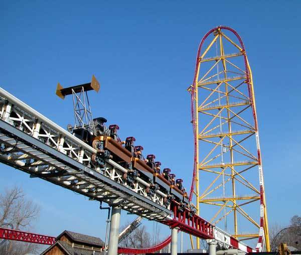
– Cedar Point is notable for its record-breaking roller coasters. This year, it will open Valravn, a dive coaster set to break 10 world records. Cedar Point also opened the first 200-foot roller coaster, Magnum XL-200; the first 300-foot coaster, Millennium Force; and the first 400-foot coaster, Top Thrill Dragster.


Like Cedar Point, Hersheypark’s website is implied to be Hersheypark. Its credibility is tied to that of Hershey Chocolate Company, as the company itself owns the amusement park. This, I feel, is plenty of credibility to the average American – Hershey chocolate is a staple in many American homes. Hersheypark is also very old – though not as old as Cedar Point, the park opened in 1906, and possesses several notable roller coasters, such as Storm Runner and Fahrenheit.

Six Flags Great Adventure, for its part, has Six Flags to back it up – a huge company, Six Flags owns many parks, and it certainly wrote Great Adventure’s website. Its credibility is Six Flags’s credibility. In addition, Great Adventure possesses the tallest roller coaster in the world, Kingda Ka, which absolutely helps establish its credibility when it comes to roller coasters.

Having established the authors and the audiences of the websites, we must turn to their purposes – the goal of the websites, of course, is to draw people to the parks. Cedar Point, for its part, operates from mid-May until the end of October; it does not have any inhabitants outside of those months. As such, it must draw as many people as possible during the summer season, in order to make a profit. The higher the attendance, the higher that profit. For this reason, all three parks aim for their websites to be inviting and easily accessible. This can be applied to both Hersheypark and Great Adventure – though Hersheypark opens for a few weekends in April and has a Christmas event, all but the adjacent ZooAmerica is closed during the winter. Great Adventure has a longer season, but it is seasonal all the same – though open weekends in late March and April, it still must bring in a hefty profit to cover the downtime between seasons. All three want to draw visitors for the summer at any point in the year – as such, maintaining their websites is critical.

Context, which is described as “additional information about a text, such as where the text is located, how it is meant to be read, or what surrounds it” (24) does not seem to apply overly much to any of these websites; that said, Cedar Point and Hersheypark do have long histories. As said above, Cedar Point was opened in 1870 and Hersheypark in 1906; therefore, they were in operation long before the Internet even existed. As it stands, though, their websites show no real signs of hailing back to that history (at least, not in a way that is of note). In addition, genre does not much apply to any of the parks' websites – their websites have modernized throughout the years, of course, keeping in line with Writer/Designer’s definition of genre, in that genre “can morph according to the local culture, the historical time period… and many other influences,” but local culture and the historical time period do not seem to feature much on these websites’ main pages. I am not sure if a genre exists purely for the sake of amusement parks, but if one does, all three parks possess that same genre.

Now that we have discussed the five areas of the rhetoric, we must examine the design choices of the individual websites.

First, we’ll speak on Cedar Point. Cedar Point’s website makes use of contrast – heavily, in fact. It contrasts bright green with its dark gold background, in order to draw the eye to where one can purchase tickets and season passes; similarly, the tab where one can find lodging is bright red on the same background. Cedar Point’s main page’s five-picture slideshow uses the same tactic – three of the five slides use blue, which is a complimentary color to the dark gold/almost-orange of the background, and all three of those slides also use bright colors like red and white, to emphasize the contrast. The red, white, and blue slide directly below particularly emphasizes the bright contrast, though the others certainly do as well.


Pictured: slideshow elements from Cedar Point's main webpage

In addition, the slide that advertises Valravn, Cedar Point’s newest roller coaster, is quite different from the rest – it is dark, where everything else is bright; it draws the eye to it. 
Pictured: Cedar Point's final, dark slideshow element

Furthermore, the website uses organization and alignment to its benefit – the tabs are organized above the slideshow to provide correct navigation, and certain important 'buttons' are aligned below the slideshow to show off season passes, one of the park’s hotels, and drink deals for the 2016 season. Though there is not much text that could be said as ‘left’ or ‘right’ aligned, what is there is definitely left aligned.

Pictured: important 'buttons' and left-aligned text

Hersheypark, for its part, takes a different route – instead of bright colors, it uses slate blues and other pastels contrasted with white to draw one’s attention. The brightest points on the page are the pictures in the slideshow, which feature families and a roller coaster. These pictures contrast well with their light, pastel counterparts - the pictures really seem to pop.
Pictured: the elements of Hersheypark's slideshow, featuring the website's brightest colors

Except for the colors presented in the slideshow pictures, the hues Hersheypark uses are analogous – they sit adjacent to each other on the color wheel, which makes them stand out. Hersheypark’s website also uses extensive organization and alignment – much like Cedar Point’s website, navigation tabs can be found above the slideshow, with important boxes (links) below, aligned perfectly with each other.

Pictured: Hersheypark's aligned link boxes and analogous colors


Six Flags Great Adventure uses colors even brighter than Cedar Point’s – like Hersheypark, its website uses analogous colors, but instead of pastels, Great Adventure boasts bright reds, oranges, and yellows. In what seems to be standard for websites of amusement parks, tabs exist above the two-picture slideshow, directing people to different pages depending on where they wish to go. These tabs are in white, contrasting with the bright colors, and the blue and gray of the sky in the slideshow pictures helps to offset the brightness as well. 
Pictured: Six Flags Great Adventure's slideshow elements

The alignment of the boxes below the slideshow are a bit different for Great Adventure, with other links and text aligned below them, but they are largely similar to those presented by Hersheypark, even if they are larger and provide more information. That said, while the proximity of the elements on Cedar Point’s and Hersheypark’s main webpage were unremarkable, Great Adventure’s main page seems almost clustered in comparison. The proximity seems to be too close – the boxes overlap the slideshow, and it almost feels like too much text in too little space. That said, all the text present seems to be left-aligned.

Pictured: Great Adventure's large, informative link boxes and left-aligned text

As one can see, a great amount of rhetorical analysis can be done on the main webpages of popular amusement parks. In addition, design and color choices have been and continue to be important in all of this - if the park can gain your attention, they may just gain your attendance, too. And as for me? I'm off to go plan my trip to Cedar Point this May. Wish me luck!